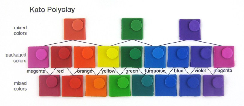
Kato Polyclay has a small, well-conceived color range.
I’ve found that the colors in the photo above, plus black and white, should be all that are needed to mix any color. You can mix orange from red and yellow that’s as vibrant as the packaged color when baked. The color named turquoise is more of a cobalt blue.
They offer a few other colors, pearl and some metallics that are really rich in mica powder.
All of these swatches were double-baked in two aluminum baking tins, one inverted as a lid with two small ceramic tiles inside. I’ve found that gives the best results with Kato. See Double-Baking to Avoid Plaquing in Polymer Clay.
CLAY FIRMNESS
Kato is generally a firm clay that conditions fairly easily. Sometimes I’ve gotten packages that were hard and crumbly and others that were too soft and needed to be leached. Generally, it isn’t sticky and is easy to work with.
MIXED COLORS
In the photo above, mixtures are indicated by lines drawn between colors.
In the top and bottom rows, I mixed colors that were visually halfway between the packaged colors in the second row. They weren’t mixed half and half because some colors are stronger than others.
The primaries of magenta, yellow and turquoise mix quite well to make secondary colors, as shown in the top row of the photo above.
Don’t bother trying to mix yellow and blue to make green, or blue and red to make violet. You’ll end up with an olive green and a dark gray.
WHITE & TRANSLUCENT


White Kato turns a bit yellow when baked. I’ve found it stays the whitest when double-baked and protected by two aluminum baking pans, one inverted as a lid. See Baking Polymer Clay Without Yellowing or Cracking.
Translucent raw Kato is a bit yellow. The longer you bake it, the darker yellow it gets. It plaques a lot if not double-baked. See How to Avoid Plaquing in Polymer Clay.
COLORS THAT DARKENED WHEN BAKED
Colors that darkened noticeably when baked:
- green
- magenta
- translucent
Colors that darkened a little when baked:
- red
- turquoise
- white
The rest of the colors remained quite true.
COMPENSATING FOR COLOR SHIFTING

I compensated for color shifting by adding white or yellow. These came very close to the raw clay color, except the green could use some more white and/or yellow.
Yellow can be used with green because it already contains yellow. The end result is a bit more vibrant than when mixed with white, as shown in the photo above. Yellow is a weaker color, so it takes quite a bit, about 1/4th.
For other colors that shift, adding about 1/8th of white works. I’ve heard of adding translucent, but translucent has its own set of challenges, as mentioned above.
Test these methods of compensating by baking small swatches before making a project.
DOUBLE-BAKING HELPS KATO POLYCLAY
The surface of Kato has fewer bumps when double-baked. See photo below. It’s not perfect, but it’s much better. Translucent Kato has almost no plaques when double-baked and it stays a little lighter in color. Notice the plaques in the green especially in the bottom row.


AVAILABILITY
I buy Kato at Hobby Lobby and online at PrairieCraft.
CONCLUSION
Kato green and magenta shift the most when baked. Red and turquoise shift a little. This can be corrected with a little white and/or yellow.
White turns a little yellow the more it’s baked. Translucent turns quite yellow the more the more it’s baked. Kato plaques a lot. These issues can be corrected fairly well by double-baking.
Kato is generally a firm clay that conditions fairly easily. It isn’t sticky and is easy to work with.
I’ve had some problems with Kato cracking when baked. Leaving it in the oven to cool seems to help cracks seal up.
Official Kato site: http://katopolyclay.com
P.S. I bought all these products myself and received nothing from the manufacturers.

