

I received a custom order from a good friend for a necklace. She wanted one like I’d already made (blue polymer discs layered between copper discs), but with blue/green, peacock-like colors instead. Great! I had an image in mind.
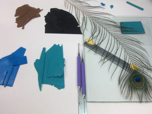
First, I got out a peacock feather and mixed colors to match in polymer clay. I wanted blue/green and blue gradated together with black holes surrounded by a rust color. I tried adding a lime green layer, but it was distracting. I also knew I wanted a circular design theme to go with the hammered, circular, copper discs.
I like to use Cernit Number One brand of polymer clay and know that I need to add a bit of white to colors because they darken more than other brands when baked.
Next, I started making test stacks of mokumé gané. Mokumé gané is a Japanese metalworking technique adopted by polymer clay artists many years ago. Basically, you stack sheets of two or more colors, press a design into the top with tools or various things and then slice off layers. The result is somewhat unpredictable and you can get really pleasant surprises. I keep a small cross section of my mokumé gané stacks so I can copy the order and thickness of the layers of those that turn out well.
I liked the first test stack I made (top four slices on the left in the photo below), but the colors were too dark, so I added more white. Way too much. The colors became too bright.
I also liked the designs I made in the first text stack, but then I ventured into designs that looked more like Swiss cheese, craters of the moon, cells under a microscope or a sponge. I wanted the black spots to resemble the spots on a lily. This meant carefully considering the spacing and size of ball stylus tools I was pressing into the clay.
More often than I care to admit, I make something I really like right off the bat, then struggle to reproduce it.

Below are some slices I thought were worth making into discs. My favorite, and the one I finally used, is in the upper left.

Some baked discs are in the photo below. Too light, too dark, too moon-crater-like… Finally, the discs at the bottom were what I’d envisioned.


What did I learn? If the clay is somewhat translucent, like certain Cernit colors, sliced thinly and put on top of black, the colors will become darker. It seems obvious now, but it took some head-banging for me to realize it. Baking test pieces is the only way to know. Also, the diameter of the ball stylus tools I pressed into the clay and their spacing was important for creating the effect I wanted.
Trial and error is part of creating. Be patient with yourself. Polymer clay doesn’t cost that much, so try, try again if things don’t work out. Don’t settle for something less than achieving your vision.

Your finished piece is very striking, Phyllis. I’ve had some shocking results from mokume gane, but I keep trying!
LikeLike
Thanks, Cheryl. There are ways to somewhat control the outcome, although the surprise of it is part of the appeal. Keep trying!
LikeLike
Wow, I’m so glad to see this, I found it on polymer clay success!!!!!
LikeLike
Thanks, Patti! I think Polymer Clay Success is wonderful.
LikeLike
Thank you for sharing your blog, as someone who has been at this seriously for only about a year, I plan to keep reading. I love the final outcome of your necklace. Everything about it flows beautifully. Thank you again.
LikeLike
Thanks, Susan!
LikeLike
Wow such fantastic information thankyou for your wonderfull work
LikeLike
Thanks, Lesley!
LikeLike