


How colorfast are the pigments used in polymer clay? What products and colors used on polymer clay are the most colorfast? How well is fading prevented by Golden Polymer Matte Varnish with UVLS (Ultra Violet Light Stabilizers)? I hope this test answers these questions. If you’re selling pieces and can’t control how they’re stored or used, it’s important to know.
METHODS
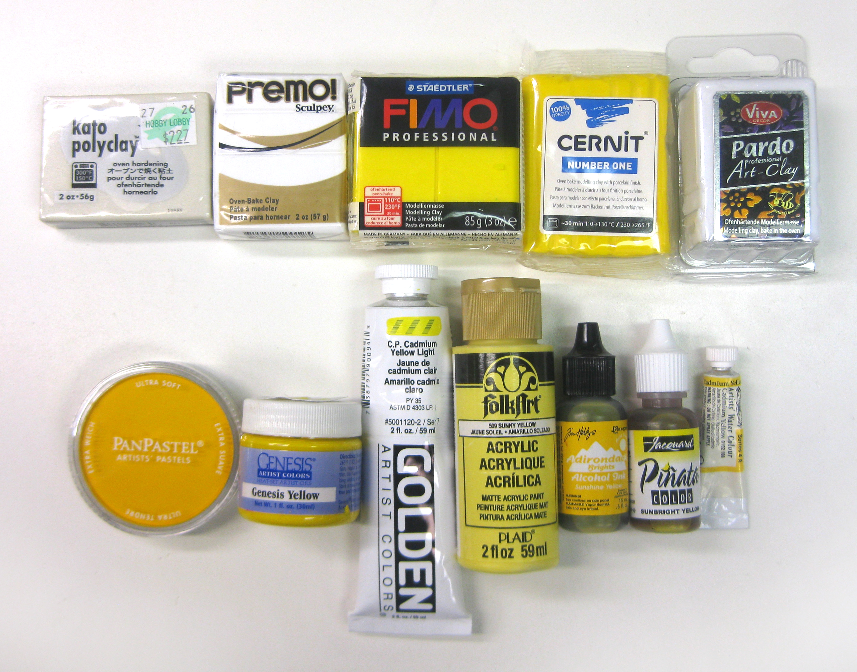
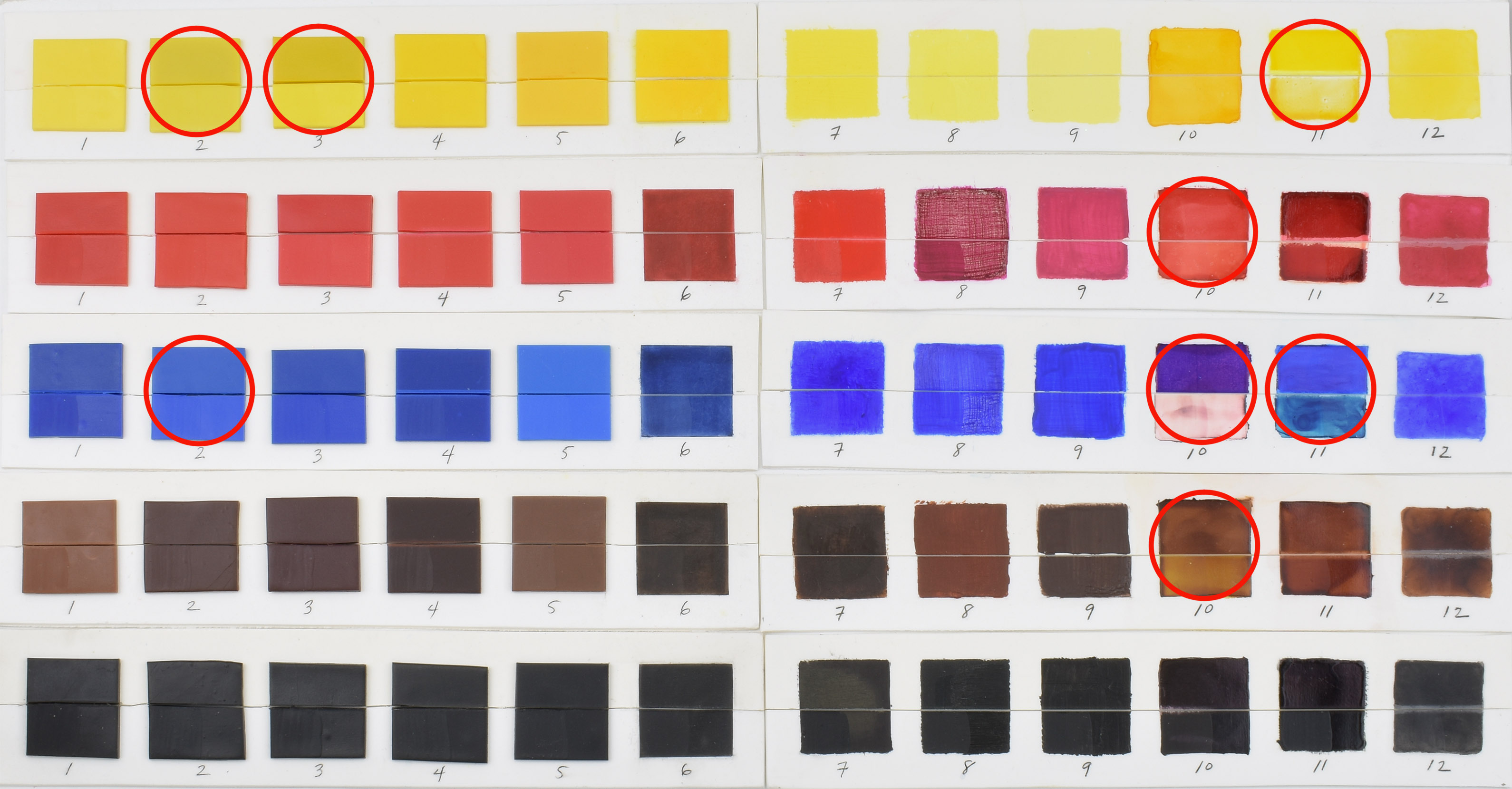
I baked ten strips of white Cernit and applied the following twelve products in five colors: yellow, red, blue, brown and black.
- Kato Polyclay
- Premo!
- Fimo Professional (except for Chocolate Fimo Soft)
- Cernit Number One
- Pardo Art Clay
- PanPastels
- Genesis Heat-Set Oils
- Golden Acrylics
- Folk Art Acrylics
- Ranger Adirondack Alcohol Inks
- Jacquard Piñata Alcohol Inks
- Winsor & Newton Professional Watercolors
The polymer clays and pastels were baked for 30 minutes at 275˚. That seemed like a good average temperature, though it’s hotter than recommended for Fimo, Cernit and Pardo and cooler than Kato needs. I don’t believe curing temperature will affect the colorfastness of the pigments used in polymer clay.
The paints and inks were applied to baked clay. The clay was sanded before applying the watercolor so it wouldn’t bead off. The watercolor was also sealed with Sculpey Liquid Clay so it wouldn’t scratch off. The Sculpey Liquid Clay, Genesis Heat-Set Oils and acrylic paints were briefly heat-set with a heat gun.
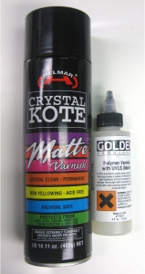
The alcohol inks were applied last. They were not heat-set because heat can alter their color. The pastels were sprayed with Helmar Crystal Kote matte fixative because they were smearing. The Helmar spray gives some UV protection. (Thanks to Ginger Davis Allman for finding this alternative to PYM II.)
Then I cut the strips in half lengthwise and put the top halves in a dark cupboard. On the bottom halves, I applied Golden Polymer Matte Varnish with UVLS over the left quarter of each color, so each swatch is divided as follows:

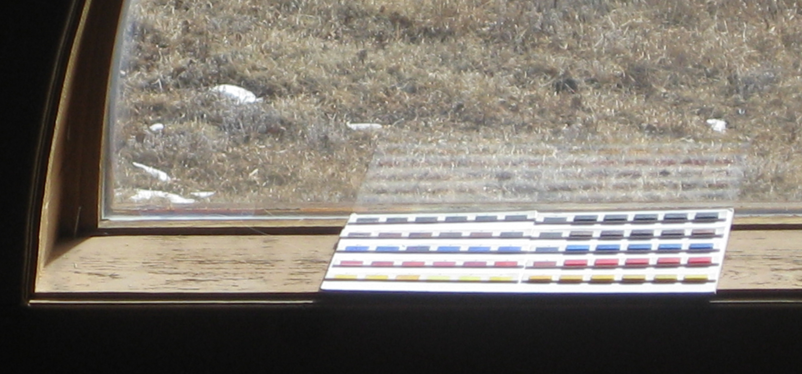
Then I placed the bottom halves in a south-facing window. I live at 8500 feet and it’s usually sunny, so they’ll get plenty of ultraviolet rays. Hopefully this test will give an accelerated example of what can happen.

QUALITY OF COLORS
Products are always changing, but in general, pigments are known to be less fugitive than dyes. For more about this important difference, read this article at The Blue Bottle Tree. Also consider that student grade products are less expensive because the manufacturer may have saved money by using colors that aren’t as lightfast.
In this test I used very basic colors. I tried to use similar colors for each medium, but availability varies. Where I had a choice, (with Golden Acrylics and Winsor & Newton Watercolors), I used colors labeled the most lightfast.
When the manufacturer doesn’t offer such labeling, pigments that have withstood the test of time, such as alizarin crimson, cadmium red and yellow, yellow ochre, cerulean blue, ultramarine blue, cobalt blue, cobalt violet, viridian, chromium oxide, raw or burnt sienna/umber or ivory black should be more reliable than a color named “sky blue,” for example.
For in-depth information about pigments, paints and art materials, The Artist’s Handbook of Materials and Techniques by Ralph Mayer is a good reference book. It’s been reprinted since 1940 and is considered the “artist’s bible.”
WHAT I THINK WILL HAPPEN
I’m guessing the dye products (alcohol inks) and the cheaper Folk Art brand acrylics will fade first. The pigment products (pastels, oils, acrylics, watercolors and polymer clays) will be slower to fade. Overall, the reds will fade first because they’re notoriously fugitive. The black and brown pigments will fade very little. The black and brown dyes may not fare as well.
It will be enlightening to see what really happens and how long it takes. I’ll post comparison photos at regular intervals.
UPDATES
All of the following photos are taken with the same camera, lighting, f-stop, focal length and exposure time. I don’t do any Photoshop work except to straighten the outside edges and add the red circles to make it easier to find the swatches that are changing.
One day later, January 29th AM: The Golden Polymer Matte Varnish with UVLS is visibly lighter on some of the darker swatches and the alcohol inks than when I first applied it. According to the Golden website, “There is no way of applying a satin/matte finish to a dark color without lightening it.” The matting agents make it lighter. OK. I didn’t know that. If I cover it with a gloss finish UVLS, it would be less obvious.
Four days later, February 1st: Two of the alcohol ink swatches have gotten darker: the yellow Piñata and the blue Ranger, which I’ve marked with red circles. The blue is more noticeable than the yellow. This is probably an effect of solar heat as the alcohol inks were not heat set. I measured the temperature of the surface of the clay with an infrared thermometer at noon on a sunny day and it was 95˚F to 98˚F–not terribly warm compared to an oven. The UVLS coating made no difference in preventing this darkening.

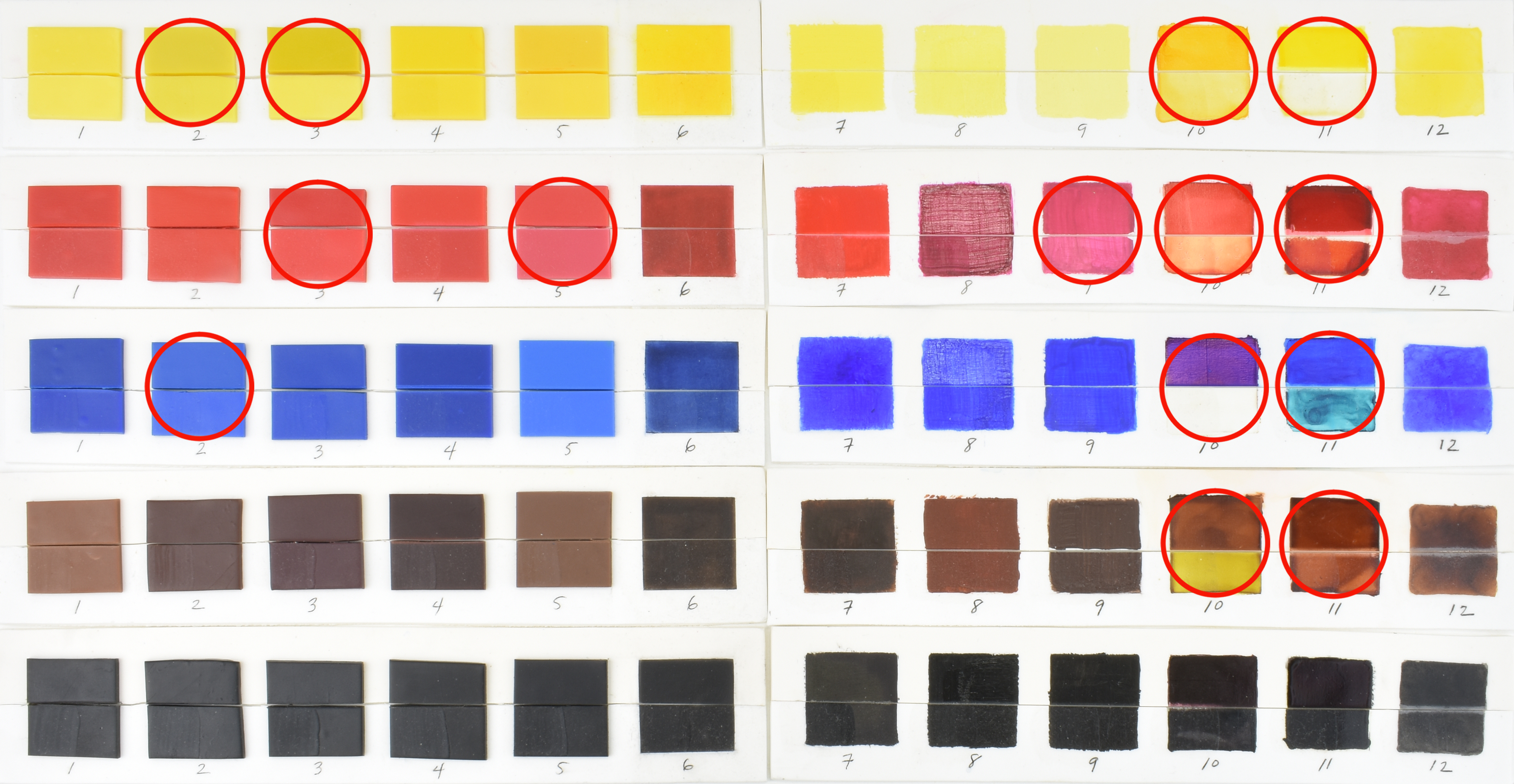
Almost a month later, February 24: Starting at the top left: The yellow Premo and Fimo are getting lighter and the change in Fimo is quite noticeable. The yellow Ranger alcohol ink swatch remains darkened as before. The Ranger blue alcohol ink swatch has continued to darken into a violet gray. The Piñata blue alcohol ink swatch is starting to turn greenish. All the rest of the swatches appear unchanged. The UVLS coating hasn’t made any difference.

Six weeks later, March 10, 2018: Starting at the top left: The yellow Premo is a tiny bit lighter. The yellow Fimo has gotten even lighter. The yellow Ranger alcohol ink swatch that had darkened is now getting lighter. The Ranger blue alcohol ink swatch has drastically faded and almost looks like an X-ray of my brushstrokes. The Piñata blue alcohol ink swatch that was turning greenish has gotten a bit darker. The Ranger brown alcohol ink swatch has lightened. All the rest of the swatches appear unchanged. The UVLS coating hasn’t made any difference.
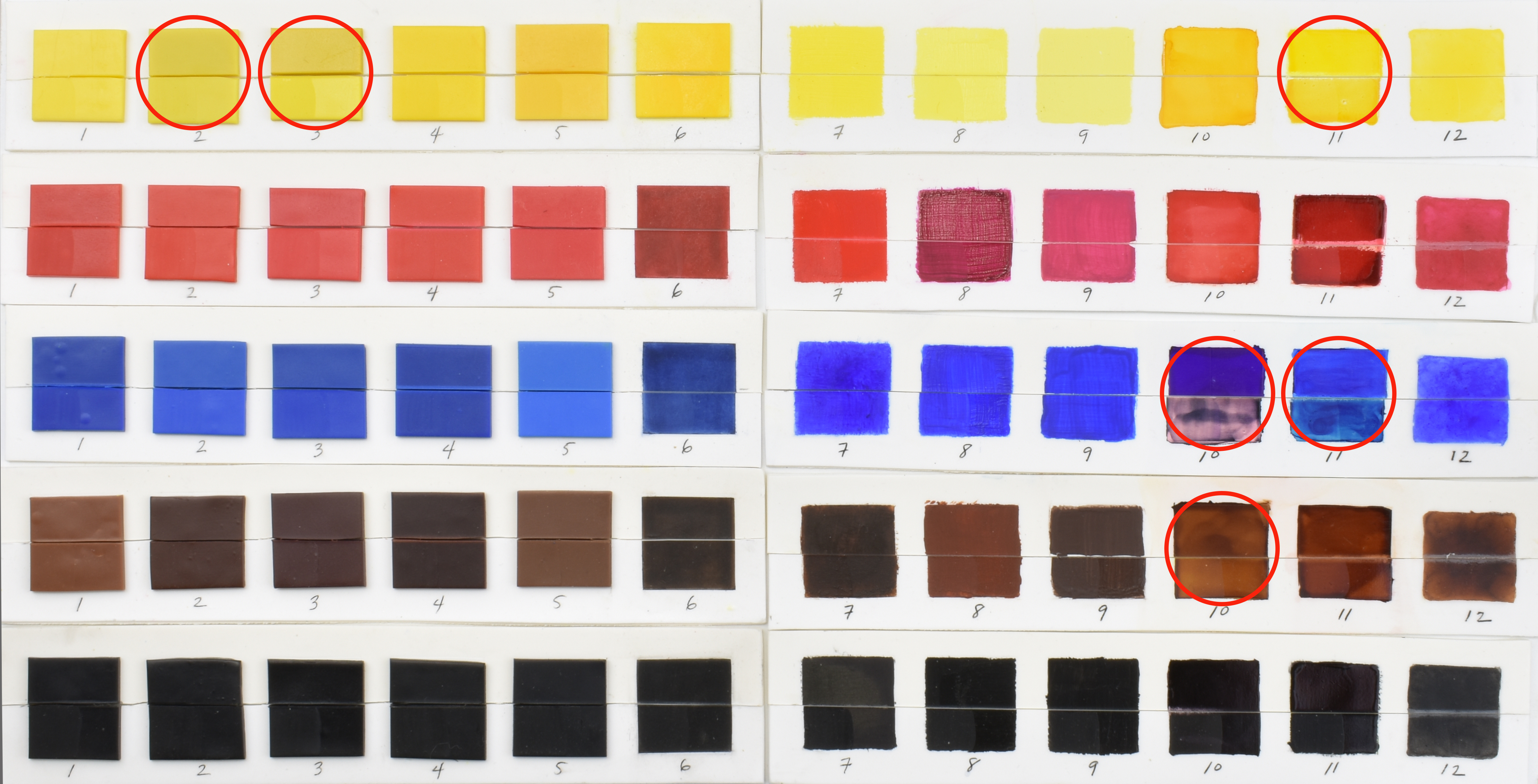
Two months later, March 24, 2018: Starting at the top left: The yellow Premo looks the same as last time. The yellow Fimo has gotten even lighter. The yellow Ranger alcohol ink swatch looks the same as last time, too. The Ranger blue alcohol ink swatch has faded until it’s mainly pink. The Piñata blue alcohol ink swatch that was turning greenish has gotten a bit lighter. The Ranger brown alcohol ink swatch has lightened some more. All the rest of the swatches appear unchanged. The UVLS coating hasn’t made any difference.

Ten weeks later, April 7, 2018: Same as last time except the yellow Fimo and the Ranger blue and brown alcohol inks have faded even more.

Twelve weeks later, April 21, 2018: The Fimo yellow and Ranger blue and brown alcohol inks continue to fade. The blue Premo is starting to fade slightly. The rest look stable for now.

Fourteen weeks later, May 5, 2018: New development: the red Ranger alcohol ink is starting to fade. The Ranger blue alcohol ink continues to fade. The rest look stable for now.
Sixteen weeks later, May 19, 2018: No noticeable changes.

Eighteen weeks later, June 2, 2018: The red Ranger alcohol ink has faded a bit more. The rest look stable for now.

Twenty weeks later, June 16, 2018: I can’t really see any change.

Twenty-three weeks later, July 4, 2018: It looks about the same as last time. I waited three weeks this time. I think I’ll switch to one month intervals to post updates.

Twenty-seven weeks later, August 4, 2018: I can’t see any change from a month ago.

Thirty-four weeks later (eight months), September 22, 2018: The yellow and blue Piñata alcohol inks have gotten lighter. So have the remnants of the blue Ranger alcohol ink. I don’t see a change in the other swatches.

Forty-five weeks later, December 11, 2018: The Ranger yellow and the Piñata red are starting to fade. The blue Ranger alcohol ink is totally gone. I don’t see a change in the other swatches.

Almost a year later, January 19, 2019: Not a lot of change from last month. The red Fimo might be starting to fade. The red Ranger alcohol ink looks a little lighter.
There have been big changes if you compare the swatches from a year ago though, with the alcohol inks being the most dramatic. I put the photo from a year ago, before the test began, at the bottom for comparison.

I’ll continue to monitor the fading as time goes by.

Almost fourteen months after test began, March 18, 2019: I can’t see any difference from two months ago.

Almost sixteen months after test began, May 20, 2019: I can’t see any difference.
Almost 23 months after test began, October 16, 2019: All the alcohol ink colors tested have faded, except black. The red Pardo and Folk Art Acrylics have faded a bit.

Two years and four months after test began, May 29, 2020: There’s a bit more fading on some of the tiles that were already fading. The rest look the same. I can see a little bit of protection has been given by Golden Polymer Matte Varnish with UVLS on some of the alcohol inks that had already faded.

Will be very interested in how this test goes. Thanks for doing it!
LikeLike
Thanks, Jan. Me, too!
LikeLike
Hi Phyllis,
I am always in awe of the thoroughness and attention you devote to your product testing. The info is very helpful, and I truly appreciate the effort you put into it. I look forward to the results of this experiment, and to future interesting tests.
I know from using alcohol inks and alcohol markers to color an ornament for a co-worker Xmas 2016, that the color has faded noticeably under 40+ hours a week of somewhat mediocre fluorescent lighting.
LikeLike
Thanks, Tammi! I wouldn’t have thought fluorescent lights would have had much of an effect, so thank you for sharing your personal experience.
LikeLike
Thank you for your hard work on this Phyllis. This information is very important, but I certainly don’t have the temperament, time or resources to conduct this level of testing. I truly appreciate your generosity and effort.
LikeLike
Thanks, Jayne. I think it’s important to learn what mediums we can depend on long-term.
LikeLike
Thank you for your intensive and careful testing, and sharing the results.
LikeLike
You’re welcome, Deborah! Thanks for writing.
LikeLike
Surprised at how much the color faded on a few samples, while post remained unchanged. Thank you again, for creating this test, and sharing the results, so that we can all learn.
LikeLike
Thanks, Tammi. I am also happy to see so many haven’t changed.
LikeLike
Thank you so much for your diligence on this thorough experiment!
Ranger alcohol inks are the only ones available at my local craft store and I have been weighing up whether or not to buy them. Looks like a no for me.
Thank you again!
LikeLike
Thanks for your note, Cee!
LikeLike
Thank you for such great tests! I found you through your Cernit color comparisons and now I am intrigued by all of your posts 🙂 Greetings from Miami, FL.
LikeLike
Thanks, Simone! I hope the posts are helpful.
LikeLike
Whow, what a generous experiment, Thank you. So now all those luscious alcohol inks are brief, but colourfull sunsets.
LikeLike
It’s sad because they’re so pretty.
LikeLike
Phyllis, have you used acrylic inks (Liquitex) to see if they fade? I have some second-hand ones, and used them once recently. Thanks for all your great information.
LikeLike
Hi, Bette, No, I haven’t tested them. I only have one bottle but I like it a lot. They’re made with pigments, not dyes, so they shouldn’t fade.
LikeLike
Have you tried any of the oil based lithography inks on polymer clay? I was watching a few videos on Kitchen Lithography using vinegar to etch aluminum foil as a plate that looked intriguing if I could use it with polymer.
LikeLike
The only oil-based paints I’ve used are Genesis Heat-Set Oils. I’d say try it and see what happens!
LikeLike
This is so cool that you did this! My what a lot of work and I’m so thankful for your efforts! I would bet that your testing is more thoroughly conducted and analyzed than any single one of the manufacture’s did in their “labs”. Bravo!
LikeLike
Thanks, Katie. That’s very nice of you to say.
LikeLike